Brand
Brand assets
Logos, colours and typefaces for press, partners and suppliers. Please follow the guidelines below. For anything else, or for artwork in another format, email hello@lunacrafted.co.uk.
Download all assets (ZIP)Logos
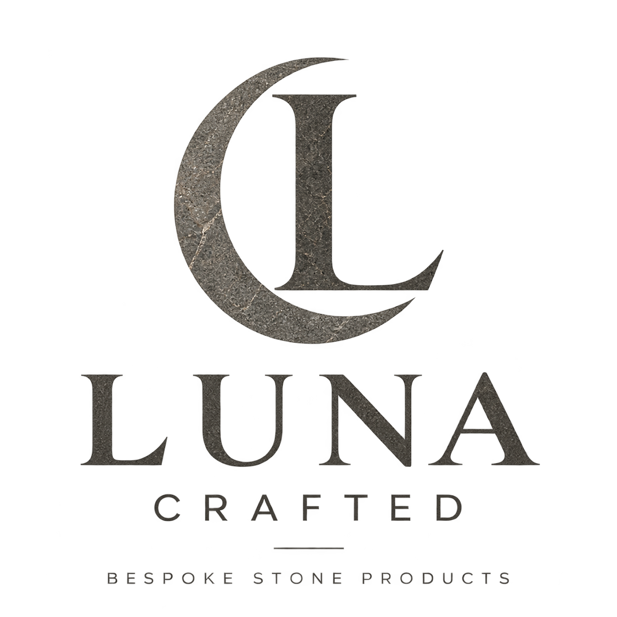
The mark and the emblem
Colour
Neutral first, one vein of gold
Around nine-tenths of any layout is limestone, white and charcoal ink. Gold appears once: a tagline, a rule or a link.
- Limestone#F7F5F0 · Backgrounds
- Ink#3A3833 · Text and the logo
- Stone#5C5850 · Large shapes
- Pale stone#D9D4CA · Logo on dark
- Charcoal#1E1D1B · Dark backgrounds
- Gold vein#7D6640 on light · #C9AE7E on dark
Typography
Two typefaces
LUNA · Aa
Cormorant Garamond
Medium and SemiBold. Headlines, product names and the wordmark. Capitals widely spaced for display; sentence case for headings.
CRAFTED · Aa
Montserrat
Regular and Medium. Body text, plus spaced capitals for labels, buttons and taglines.
Both are free under the SIL Open Font License, from Google Fonts.
Usage
Using the logo well
Do
- Leave clear space on every side equal to the height of the L.
- Keep the mark at least 32px tall on screen and the full emblem at least 120px wide.
- Use the charcoal version on light grounds and the reversed version on dark ones.
- Place the logo on a plain panel when it sits over photography.
Don’t
- Recolour it outside ink, stone or pale stone.
- Stretch, rotate, outline or add shadows and effects.
- Rebuild the wordmark in another typeface.
- Place the light version straight onto busy stone or photography.